With the inclusion of buttons my web pages were able to be negotiated around quickly and easily. I chose to create my buttons by going onto Fireworks and making the image on there, then putting it onto Dreamweaver where the link to the image was set up. This makes it look more professional and is better for the user as they can move to which ever page they want to quickly.
 |
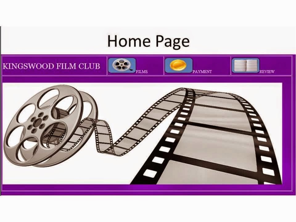
| The three squares at the top are used to navigate between the pages, the images used are symbolic of the page they take you to so they user knows what is what and on the homepage it is wrote next to them for clarity. |
HTML Form
By adding a HTML form the users were able to see what films were on offer and decide which they would like to watch. I created a form by using what I had already learned in previous tasks. I also added text fields and this allows the users to put in the relevant information. The forms were included to allow the user to easily fill in information and in the payment page it allows them to enter vital data, the layout is important for this as if it looks low quality then the user might be worried about entering that data. With the HTML form it ensures the visual layout is good enough.
Videos
As this was a film club I decided that adding the film trailers would be beneficial. This means that the users can get prior knowledge about the film and so can decide if it is the one they want to watch next. I embedded the videos from YouTube.
W3C
Due to there being a vast range of browsers used in today's world, I made sure that my website worked on all of them. I tested it on Chrome and Firefox and it worked well.
www: nice start to the task
ReplyDeleteebi: you illustrate these tools and techniques by showing some relevant screen shots.